Author
Bob Visser
CoffeeCup Chief
Design
Diego Naves
Master of art
Edits
Suzanne Norvell
Customer befriender
Document version
Version 0.91 (beta)
Production rights
Bob Visser
CoffeeCup Chief
Foundation Builder provides a real-time visual design environment for the powerful Foundation 6 front end frameworks. Together with further augmenting functions such as the width slider, custom breakpoints, global content updates, customizable prebuilt components and more, this leads to a greatly improved design workflow where creativity thrives.
Code savvy designers and front end developers will benefit from an intuitive and faster workflow that allows for more experimenting and design iterations. This results in shorter turn around times and / or more authentic, unique, site designs.
—Steven Mathis
Less (or none) code savvy designers will not be bogged down by coding details. Using visual CSS controls the focus is on the content and experience design, not on hunting and tweaking code snippets.
We have heard from a great many Photoshop and Illustrator specialists with limited CSS experience how spectacularly their workflow has improved. They are now designing in one of our responsive apps, directly for the web.
The graphics programs are now used as they should, for creating supporting materials such as icons, backgrounds and for image effects*. No more laborious static prototyping for various screen sizes, just one design that can be viewed and adjusted for any device width. And the results are super spectacular too!
Foundation Builder is also an excellent tool for those interested in learning CSS and to design with Foundation. The visual design controls in combination with the real-time preview provide an excellent feedback mechanism that helps to understand the effects of adding or changing CSS code.
However, it will probably take up a bit more time to get up and running with this app compared to somebody with CSS experience. Just remember, with the will to learn and the undo system as backup, it’s just a matter of time. Spending a couple of minutes watching these short videos in which a full responsive design is created will be a good start.
This document is currently in rough draft status. But if you ignore the typos and spend half an hour scanning this guide, it will build a a a good reference for finding your way around the app. Depending on your experience level you will pick up a lot of CSS — the language that makes the web look good —along way.
—Lauren Oakfielder
The workflow and interface of Foundation Framer are very similar to Responsive Site designer. Sometimes we will link to more indepth articles, tutorial videos or helpful tips originally created for these apps. Just thought to give you all the heads up when you notice a RSD icon or reference — the instructions will apply to Framer in the same (or scarily similar) way.
*CSS filters and blend modes are getting wider support in browsers and might come to the CoffeeCup responsive apps soon. Stay tuned!
Pssstt...this guide is always evolving. Feedback? We love it! Just leave us a note and we will be right on it.
The four main sections.
If you are reading this in the app, you’re currently looking at the most viewed part of the Foundation Framer: the real-time canvas. The canvas, marked as #1 in the image below, is a browser-based working area. A major advantage is that what you are creating, will look and feel the same as when the site is actually published on the web. The canvas is mainly used for the live design view, selecting or reordering elements, and editing texts.
The rest of the app is for managing what happens in the working area. On the right there are 5 panes, marked as #2, each with a specific role for visually managing the content, HTML, CSS and Javascript.
Right above the working area you will see a bar aka 'The Responsifier’. This bar, marked as #3, contains a number of tool for managing the design at all possible devices widths.
The Foundation framework is ‘mobile-first’. This means the design process is initially focussed on small (mobile) devices at widths to the left of the most left purple dot. Then adjustments can be made for larger screens when a breakpoint becomes active — when a purple dot shows a black center. If you’ve been hand coding with Foundation this will be immediately obvious. If not don’t worry, we will discuss (custom) breakpoints in detail later.
The toolbar, marked as #4, gives access to functions as the Page Manager, can be used to switch between several Design Modes and launch a Preview in a specific browser. In the next sections of this document we will summarize the purpose of each of the specified areas and their functions for creating responsive designs.

View elements. Click to select or use the dropdown. Edit text.

This area visualizes what the website visitor will experience when landing on the page. In combination with the Slider (part of The Responsifier), every device width can be previewed while designing.
If you are interested to see how a specific part of the design behaves at different screen widths, select any element in that section and move the slider. In normal browsers the content will flow out of view when resized, however, in Foundation Framer the selected content is auto-scrolled back into view. A small, but extremely handy perk of Framer!
On the canvas, elements can be selected by clicking on them or by selecting them from the dynamic dropdown. The dynamic dropdown appears on the canvas in the left corner of the element that is hovered over. A selected element can be dragged and dropped into a different position or column. Selected elements can also be duplicated or copied and pasted into a different area.
Text elements can be edited in place when the Text Editor is active. The editor can be activated in a number of ways. Right-clicking a text element will bring up a contextual menu that gives access to common functions, including Text Edit.
Power users will appreciate being able using a keyboard combination for the actions available in the menu. A complete list of keyboard shortcuts will be included in this document.
The most important tools to manage the content and design on the Canvas are located in the Control Panes. Let’s look at them next.
Layout, content, style, page settings, inspector.

On the right side of the UI there are 5 panes each with a specific role in creating the responsive design. The icon is replaced by the pane name upon hover. Here’s an overview of each of the panes. Details on each pane are provided in the next sections.
The pane on the most left is the Layout pane. This pane includes the controls for working with the Foundation grid. Here you can add rows, columns (which hold the actual content elements) and specify, for example, the width of a column and adjust it for different display widths.
The next pane is the Content pane. Elements like headings, paragraphs, buttons, images, and videos (and a whole bunch more) can be inserted into any column on the canvas.
Also on the Content pane are the project Components. This subpane gives access to all prebuilt components like navigations, cards and modals that are included in the project. Symbols are accessible through the Content pane. Symbols are elements such as a buy button, or components such as a footer, that are being kept in sync across all places and pages of the project.
Out of the five panes, the Design pane is probably the most frequented one. The top part is used to configure the HTML / content part of the element. For example, Foundation classes can be ‘filtered up’ from a predefined list, custom classes can be added or URLs specified. The second part contains all the inputs, tools and controls to control the design of the element, subdivided in section such as Typography, Dimensions and so on.
The fourth tab is the Settings pane. Here you can set meta data for search engine optimization. Enter a page title, description, keywords, or insert content into the head and footer sections.
The last pane is the Inspector pane. The top part gives a tree like overview of all elements on the page. It offers a fast way of selecting and reordering elements and, for example, toggling the visibility of hidden elements. The bottom part offers a preview of the CSS rules added.
This only touches upon the design and creation possibilities the panes offer. More detail on each of them can be found in the next sections. And since we are big fans of designing content-first*, let’s get started with the Content pane.
*This is very similar to designing mobile-first. A key argument for designing mobile-first is that the small space forces proper content prioritization. Content-first proposes the same, but independent of screen size. The “Disable breakpoints’ setting (see below) is a great help here.
View elements. Click to select or use the dropdown. Edit text.
The Content pane uses three sub-panes for organizing the various website building blocks, one for content Elements, one for Components, and one for Symbols.
When the Content pane is selected the most frequently used Elements sub-pane is open by default. From this pane you can add headings, buttons, images and more. These elements are the smallest site building blocks. Section 1 provides more details on the various element types.
Components usually consist of several elements. Together they perform a more complex role such as a navigation menu, a (series of) cards, an accordion or tabs. Components are discussed in more detail in section 2.
Symbols are special elements or groups of elements that are kept the exact same throughout a project. When one instance of a symbol is updated, all other instances in the project will be changed as well. This, for example, allows for updating a footer across all pages with one single edit.

Default view of the Content pane.
Elements are the most basic building blocks. They have been organized into 4 main categories. We placed the most frequently used elements, Text and then Images at the top of the pane. Further down there’s a collection of ‘common’ elements (we could not agree on better wording indeed…) to add, for example, videos or custom HTML snippets.
Elements like buttons and social media icons are grouped as Interaction elements. The last category consists of elements that can help to create sophisticated responsive Layout constructs. Each of these categories is addressed in a bit more detail below.
Click the arrow to select an element variation.

There are 6 different text elements available. The ones with a little arrow on the right of the button come in variations. Clicking the arrow of, for example, the Heading 1 allows you to choose from a heading 1 - 6.
Each of the elements performs a different (semantic) role. A heading element, for example, describes the topic of the section that follows. A paragraph is usually a block of text and so on. Simply choose the element that you feel will most suit the purpose of the text.
The placeholder texts can be replaced by typing or pasting text blocks in Text Edit mode. Triple-clicking a text element will start the text editor. Alternatively, you can use the edit button on the Design pane or use the right-click menu.
The Text Editor can also be used to add inline links and formatting. The link below provides more information.
Additional resources
Select your image source from the dropdown on the Design pane.

When a picture element is added, initially a placeholder image is used. This allows for rapid experimenting or prototyping without immediately having the spend time on finding, optimizing etc. real images.
Replacing the placeholder happens on the Design pane. Double-clicking the image opens this pane. The dropdown with the Picture label lets you switch between the placeholder and a local or online image.
When selecting a local image you will be asked to select one from the file system. The chosen image will be added to the project and be displayed instead of the placeholder image. When you choose to publish or upload your project, this images will be included in the images folder.
You can also provide a link to an online image. In that case you can insert (paste) the URL to the image in the input box that appears below the dropdown.
The Design pane is probably where you will be hanging out most of the time when working with Foundation Framer. This pane is discussed in detail further down below. However, we already touched upon it above and the temptations to start tinkering with the visual CSS controls is probably high.
The controls are mostly self-explanatory and since you will see the result of your edits in real-time on the canvas, please feel free to toy around a bit. Just keep in mind that for an efficient workflow an understanding of CSS selectors will be greatly beneficial. More about that in the Design pane section!

Using an online image.
You will notice that a newly added image will not be wider than 200px. This can be changed on the Design pane with the max-width control.
Foundation Framer uses the brand new <picture> element. This allows you to change the image at breakpoints, serving smaller images to mobile devices for better performance. Our very own Suzanne wrote an excellent article about this, please check it out!
Additional resources
Well, maybe not all that common… The horizontal rule certainly is, but we need to talk a bit more about the HTML en Video elements.
The HTML Element can be used to add custom code snippets or exports from other apps. This can be CoffeeCup apps like Web Form Builder, Responsive Content Slider or 3rd party apps. To not interfere with the other elements on the page currently a placeholder visual is displayed.
The Video Element allows for embedding responsive videos in the page. Indeed, responsive because most other video embeds will not automatically adjust to different screen widths!
Currently, you can embed videos from the most important video services. If there’s one you think we should add please use the ‘Rate this app’ function under help and let us know in the comments what we can do for you.
Additional resources
The elements in the group generally perform and action following interaction with the visitor or user. A Button Link can open a menu, reveal a hidden element or show modal dialog. It can also take the user to a different location, on the page, site or to an entirely different site. Component (see below) often include this interactive behavior.
The Form Container, together with the Submit Button can, for example, be used to build custom HTML Paypal payment buttons. It can also include other form elements found under the Input dropdown. Please note that the form (elements) can be hooked up — inputs for this are provided on the Design pane. However, form scripts or creating a fully functional form are beyond the scope of this app. For that we refer to Web Form Builder.
The Social Icons can both be used to build a following on the social networks and allow visitors to share information. Select the Follow or Share option on the Design pane (for networks that support these), then fill out the various options.
Additional resources
Layout elements offer more granular control over the page layout. They are also be used to build logical groups of elements or groups with a specific role of function such as a footer or card component.
The Subgrid Element gives the exact same control as the overall Foundation grid, but within a subset of the page. This element can be added to a column (or even container) to create custom layouts within that section. Just as the main grid subgrids can be reconfigured, e.g. columns widths can change, at breakpoint. These changes are also managed on the Layout pane.
List Containers are unordered lists with each list item being its own container. They are often used to build navigation components.
Containers often serve as ‘wrappers’ for related elements. When creating a card (component) the container often encapsulates one of more text elements, an image, a button and sometimes sub-container with additional elements. We will look at this in more detail in the Component section.
A link Container functions exactly as a container, but wrapped in an <a> label, making it one big link element.
Additional resources
Ready-to-go components are the bomb!
One of the coolest advantages of using the Foundation framework is the ability to utilize interactive site items. Foundation offers an elegant way to build navigation menus, accordions, cool tab panels, modal dialogs, drop ups, and much, much more without having to mess with external scripts.
Creating your own interactive components is done visually by combining HTML elements, (predefined & custom) CSS, and the framework specific attributes. Mixin interactive scripts to create off-screen navigations, flex-cards, info-pop-ups, or galleries. Foundation provides detailed documents on how components are structured.
Save custom components to your library to reuse them throughout your projects. Items can be given a description and organized in folders to keep you organized.
Additional resources
Using an online image.
After adding a component to your project, you can access them on the Components sub-pane of the Content pane.
The first part of the pane shows a preview of the component. To improve visibility — a white component does not display that well on a white background — the background color of the previewer can be toggled. The bottom left button can change the setting between white, black and transparant.
The plus and minus buttons next to the background color button can be used to zoom in and out. In case there are similar components in the project, this provides a good level of detail to find the right one.
The preview shows the currently selected component form the list below the preview window. Clicking on a component will expand it so the name can be edited. To add a component to the canvas, click the plus (+) button. It will get inserted below the currently seleted element. If a columns or container is selected, it will be placed below the last element in the parent. If the component itself is a column or row, it will be placed below the currently selected container or row.
The New Component button creates a fresh component based upon the currently selected element (group). This component will be placed at the bottom of the list. Project components can not be reordered, filtered or sorted at this moment.
To remove a component from the list use the delete (X) button. Note this this will not remove the component from the canvas, only from the list.

Select a component to preview or rename.
The CoffeeCup Component Library is a handy collection of prebuilt components that can be used as building blocks for any project.
Most of the components found in the theme are core framework components — they are very similar to the components in the official Foundation documentation. Using these ‘base’ components this theme can be used for both for quick functional prototyping and as a solid, proven, foundation for new projects.
In addition, we are creating a projects that includes common Foundation components. Right, there’s a lot of them so it is a work in progress. But we did not stop there, it includes descriptions of how these components have been constructed as well as improvements and variations.
Foundation components generally consist of a number of nested elements combined with predefined classes. The image shows the classes for an accordion item.

The foundation classes for an accordion item.
The image shows that the is-active Foundation classes have been disabled. This makes sure that any custom styles are only tied to the accordion-item class. We will talk more about the use and de-selecting of classes in the Design pane section.
Additional resources
Create better and faster with components.

Foundation Framer gives you a leg up by including ready-made, customizable site items. Access these by clicking the Components icon in the top toolbar. Browse the ever-growing CoffeeCup Component Library, when you find one you like, click Add to Project. This will import the item into the Content pane > Components. Then style and adapt it to fit your content.
Symbols: edit once, update everywhere!
Symbols are elements or groups of elements (components) that are kept the exact same throughout a project. When one instance of a symbol is updated, all other instances in the project will be changed as well.
This, for example, allows for adding a footer link across all pages with one single edit. Keep in mind that a single element such as a buy button or copyright notice that comes back in various place of a project can be a candidate for a symbol as well.
In the image below the footer symbol is selected on the Symbols sub-pane. The entire symbol is visible in the preview area, just as with the components. On the left, part of the footer is also visible on the canvas.
When a symbol is selected, it is surrounded by an orange line on the canvas. This is to help differentiate between symbols and ’normal’ element groups. The Symbol container will also have an orange dot on the right in the tree view of the Inspector pane. This pane will be discussed later in this guide.

Previewing Symbols
Symbols can not be nested — symbols can not contain other symbols — because that could create an update loop nobody can get out of...
Adding a Symbol to the Canvas works the same as for components. However, any changes to a Symbol will update all of the ‘instances’ — wherever they are located in the project Foundation Framer will keep them all exactly the same everywhere.
Creating a New Symbol also works in the exact same way as creating a new Component. When a symbol is deleted, it will be removed from the list, but all instances will still be in the project. From that moment they will behave as normal element groups, any changes will no longer trigger updates anywhere else.
When looking at the image below, you will also note a few differences. For starters, the name of the Symbol is followed by an instances count. This tells you how many times the Symbol is used in the project.

Managing Symbols
The name of a symbol can be change using the Name input. With the See on function you either can circle through the pages where an instance of the symbol is located, or directly jump to a specific page with the dropdown. Using this function the canvas is automatically scrolled to the place on the page where the Symbol is located.
Visually manage the Foundation grid.
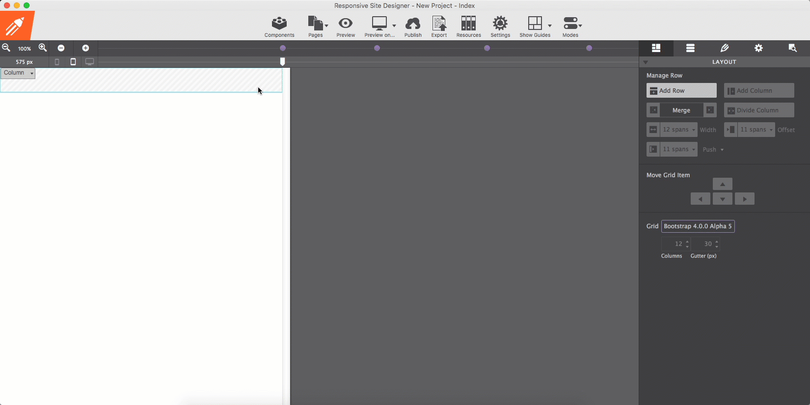
Design grids have been used with great success in print design for decades. A grid consists of a series of rows and columns, very similar to a spreadsheet, that helps to create order in the way information is presented. The grid is managed from the Layout pane.
Most buttons on this pane are rather self-explanatory. The Add Row buttons adds another row below the currently selected (or active) row. The Add Column button inserts a column inside of the currently selected row.
The content elements we looked at in the previous section ‘live’ inside the columns. This creates the desired order and alignment. Unlike these elements, rows and columns can not be dragged and dropped.
Row and columns can be moved around with the Move Grid Item control. Please note that columns can not be moved to another row. However, a column can be copied to the clipboard and pasted into another row.
Columns can be merged with the left or right neighboring column using the Merge arrows. A column can be split with the Divide Column button.

The powerful Layout pane.
The Foundation grid uses a 12 column system — basically, that means that each row can hold up to 12 columns. With each column spanning 1/12 of the row, the 12 columns will fit. However, columns can also be instructed to take up — 'span' — a larger part the row. This is done with the span-width dropdown.
A span of 6 means a column takes up half (6/12) of the row. That leaves room for another column with a span of 6 next to it (or 2 columns with span 3 etc). If the total span exceeds 12, the columns that don’t fit will be placed below the proceeding columns. This way content can be placed next to each other on wide screens, and appear stacked on mobile devices.
The span-width control is the most important tool for building the layout and for subsequently adjusting the layout for different screen widths. Layout changes at breakpoints will be addressed later in this document.
The Offset and Push/Pull controls can be used to create advanced layouts. The layout of this document provides a good example.
At small and medium widths — everything on the left of the second (768px) Foundation breakpoint — all columns span the full width of 12 columns. However, this changes on the right of the breakpoint — there the main columns use a span of 9 and are being offset by a span of 3 to create room for an occasional column on the left.
On the right of the third breakpoint another layout change is made. The main columns get a span of 5 and are being offset by 2.
Layout adjustments like this are super easy to create with Foundation Framer. How this exactly works will be explained further down below. First, let’s get to work with the great Design pane!
Additional resources
Some grid systems restrict the width of the rows by default, frequently to 1200px. This keeps the content centered on larger displays. To make a row stretch, the Max-width restriction needs to be removed.
In Foundation the rows are always taking up the full width — by default the Max-width is set to none. To center the content, a max-width can be added to the row. However, if the background of the row needs to stretch the full width, the content must be centered in some other way.
There are various ways of doing this, depending on the design case. A versatile, yet fail-proof method is adding a subgrid or container element. Their width can be limited using the dimension tools and be placed in the middle by setting the left and right margins to auto. This content can then be placed inside the subgrid or container.
Manage element settings. Set styles.
The Design pane consists of two major sections. The top-part — the Element part — is for 'configuring' the selected element. Here you can specify, for example, the link of a button or provide alt text for an image. This is also where you can also select and add Foundation (and custom) classes or add data attributes for creating interactive elements.
The second part is for adding Style(s) — for specifying the way the selected element looks. All CSS style properties are available through a set of intuitive design controls creating tremendous design powers!
Let’s get started with the Element section, then work our way down to all those fancy design tools.

The two main sections of the Design pane.
The length of the Element section varies per Element Type. The image shows what the section will look like when an element of Type Picture is selected. The element type here is purely informative, this can not be edited (right now).
The ability to add CSS selectors — Classes and ID — to an element is an important part of this section. A selector ‘binds’ an element or group of elements to design rules defined in the Style section on the second half of the Design pane.
The Predefined dropdown can be used to search and add classes for which the design rules have been pre-specified in the Foundation framework. For example, the thumbnail class that can be seen in the screenshot adds padding and a thin border to an image.
Clearly this can also be done manually with the Dimensions and Border tools in Foundation Framer. There is no requirement to use these predefined classes, but sometimes they come handy, especially when creating interactive components such as accordions and navigations. In addition, the design rules associated with a predefined class can be fully customized using the CSS tools in the Style section.
The Picture dropdown we discussed before and is specific to this element, as is the input for the Alt text.
The buttons below the Alt input can be used to duplicate or delete the element. In case a text element is selected there will be a third button — this edit button can be used to start the text editor.
The data attributes play an important part in adding interactivity to a design. See them as ‘hooks’ that tie and element to Javascript. and clarifying can be used to as and to specify additional information about the element.

The Element section of a Picture element.
For those that have been working with selectors before, the workflow in Foundation Framer will feel intuitive and powerful. It will still help to give this section a quick read and, for example, familiarize yourself with the color coding system for the different selector types.
If you never heard about or worked with selectors before, no worries. Our responsive apps can also automatically create selectors. However, to get the most out of our apps — to speed up the design workflow and make it easy to maintain any projects — we do recommend to slowly start accustoming yourself with the apps selector system and predefined Foundation classes. This section will serve as your guide.
A selector defines — ’selects’ — the elements to which a set of CSS rules applies. This is incredibly powerful because it makes it fast and easy to give multiple elements the same appearance. Or to apply the design rules to a newly added element without having to redefine all these rules. Let’s quickly go over an example using the class selector.
In Foundation a button is created by adding the class button to an element. The class (name) is the carrier of a set of styles such centered text, padding around the text and so on, that this way get applied to the element.
Other styles can be added by extending the rules set for the same class, or by adding another class with new rules. Foundation uses the second approach — by defining all base button styles on the button class and applying additional rules through new classes, contextual variations are created.
In the example below all three button elements use the button class. By default, these buttons appear blue. Then the green button is created through the success class. The orange button uses warning.
The additional class names create the contextual background color. Now you can make changes to all buttons by working with the button class, to all success buttons using the success class and so.
If you prefer a different type of base button set in your project, for example buttons that are the same width and have rounded corners, simply define these styles (in the style section that we will look at in a bit) on the button class and all buttons will take on that appearance.
Please note that I had to add one more class — button-cstm —to make these changes, if I had done that one the button class itself it would also have affected the previous example.
With this explanation and example under our belt, we should be ready for some more selector goodness. We will do that when discussing the style section next.
As explained above, style definitions are related to selectors and the top part of the style section is used to manage exactly that.
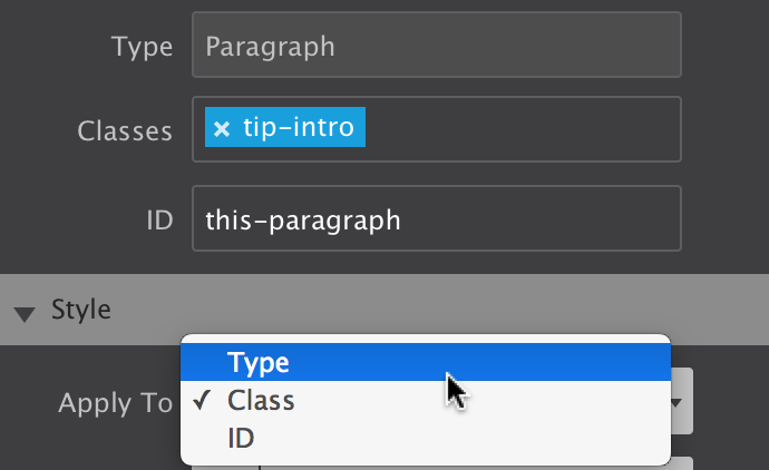
The Apply To dropdown is used to select the type of selector the style rules will be associated with. The choices are between Element Type, Class and ID.
The State dropdown can be used to specify a special state of the element targetted by a selector. For example :hover will apply a style when the user hovers over the element associated with the selector.
The Reset function helps to keep the project code lean and clean. The dropdown gives an overview of the styles that have been applied. Styles can be removed by clicking on them.
Each of these three functions is explained in more detail below.
The Style controls are organized in logical sub-sections such as Dimensions and Typography, on the second part of the Style section. They are discussed in part 3 below.

Selector management and Style Control Sections.
The selector options in the Apply To dropdown start with the broadest selection of elements, followed by a subset, and ends with the selection of a single element:
The three selector types.
The most efficient workflow is to first define styles for element types. This way a common ‘starting style' for all elements of that type can be defined.
For example, when Type is selected in the dropdown, further down on the pane in the Typography section Roboto can be set as the default font-family for all paragraphs.
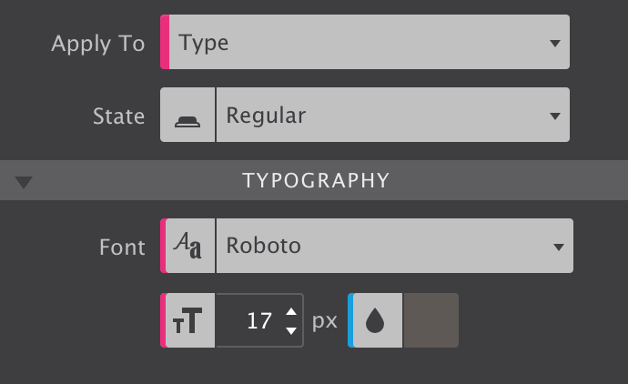
The Type selector in action.
As can be seen from the above image, styles applied to the type have a pink indicator.
This way the font-family and font-size for all paragraph can be updated with one single edit. Also, whenever a new paragraph is added, these styles will already be present.
Additional resources
With all default styles for the elements in place, Classes can be added to create design variations. For example, certain paragraphs that perform a different role can be given a different font family, size and/or color using a class selector.
To apply styles to a Class simply enter a class name in the Classes box (in the Element section of the Design pane). Also make sure to select Class in the Apply To dropdown. Now all style adjustments with the design controls below —yes, we will get to work with them real soon! — will be tied to that class.
Any control used for applying a style to a class uses a blue indicator, like the font color thumbnail of the image in the previous section.
The Class selector is more frequently used during the life-cycle of a project and therefore the default option in the Apply To dropdown.
Make sure to choose the correct selector in the dropdown when switching between elements.
So what happens when different styles are assigned to different selectors? Some selectors are more powerful than others, their styles will prevail. In CSS this is called specificity, the styles from a more specific selector will take precedence over styles from less specific selectors.
A Class selector is more specific than a style applied to a Type and will therefore prevail. On its turn, an ID is more specific than a class and will prevail. Styles applied to an ID have an orange indicator.
Styles attached to a class selector are intended to be used by multiple elements. To add the class to another element simply type the class name in the Class input box. The image below shows that the auto-complete can be a great help!
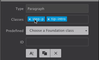
Adding and deselecting classes.
An element can be targetted by up to 5 different classes. Styles can be applied to a specific class selector by deselecting other classes. Deselected classes are gray (see ’step-p' above), any style updates will not apply to them, only to the class or class combination currently selected.
Styles can also be applied to class combinations. They are more specific than a single class and therefore these styles will take precedence.
One of the criticisms on (the use of) front-end frameworks is that it leads to sameness — many sites created with for example the Bootstrap framework look and feel the same and lack authenticity. Too many things have been predefined in too much detail.
In comparison, Foundation 6 (used by Foundation Framer) is less ‘opinionated’. With fewer framework styles to override and having a more neutral canvas to start with, designs are more unique.
There is something to say about both approaches and depending on the situation a specific approach or framework might be better suited.
We feel the ‘sameness argument' is moot when working with Foundation Framer — the visual controls make it super easy and fast to assign different styles to the Foundation classes and to give the elements and components a totally different appearance.
In addition, new custom classes can be added that bring their own style rules to the table — creating some unique is totally up to the designer!
As we saw in Section 1.1 with the button examples, Foundation has done a great job in modularizing the styles. These modular classes are designed to be used depending on the role and context of an element.
For example, this paragraph uses the class lead which makes it stand out
Using the modular class structure can be a great help in the initial phases of the project and help to think about the role of the content element. Updating the appearance by editing the styles associated with the classes, or adding new classes with different style rules is a cinch.
In this paragraph the lead-brd class is used to make it appear different.
The Predefined dropdown facilitates the use of the framework classes and prevents typos. Simply start typing what you are looking for and the list will show an increasingly precise list of matching classes.

Adding predefined Foundation classes.
We already saw that pink is associated with style definitions for an element type and that a blue indicator tells us the style was set on a class. An orange indicator would correspond with a style coming from an ID. This covers most of the situations, but there are a few additional cases we need to iron out.
First of all, we learned that classes can be deselected so style can be assigned to specific individual classes or class combinations. When a style applies to such a deselected a class (or class combination), the style control has a gray indicator.
In the image, the class side-heading is deselected. In the Typography section the indicators for the font-size, line-height and text-align controls are gray. This means that these styles belong to the side-heading class.
Here’s one more situation where the color coding can come in really handy. When styles are applied to multiple selectors, e.g. a class and an ID, the style controls show the values of the styles associated with the selector type we are currently working with. This is the selector — Type, Class or ID — visible in the State dropdown. This sounds more complicated than it is really, a quick example will make that clear.
In the image the font-weight control shows a value of 400 - normal with an orange indicator. However, the Apply To dropdown shows we are currently working with class selectors. That means that the visible value — 400 - normal — belongs to a class. The orange indicator however tells us that a font-weight value has been specified for the ID as well. To view this value simply switch the Apply To dropdown to ID and the value associated with the ID will show up in the control.
The indicator will take the color of the strongest selector, because that is the style value that in the end will be visible in the browser. So in our case, if a different font-weight has been set for the ID that is what will show on the canvas.

Selector color coding.
Selectors and selector specificity in CSS can take a little to get used to, but with this color coding system you will be an expert before you know it!
Selectors can be combined with a specific state of the element. For example, a class can style an element differently when the mouse cursor is positioned above the element.
In the image example an image overlay and button are made visible when hovered. To do this simply set the State dropdown to hover (this is also shown in the image in the next section).
Now it is just a matter of adjusting the style using the visual controls in the Style section (that we are now really really close to discussing…) to create the desired result. This can 'change’ be used in combination with CSS transitions for a really smooth effect.

A hover effect using States.
The Reset function helps to keep the project code lean and clean. Whether you applied styles to the wrong selector, accidentally designed for a different state, on the wrong breakpoint, or if you simply want to chance your approach, simply remove the styles you don’t need.
The dropdown gives a contextual overview of all the styles that have been applied. When class is selected from the Apply To dropdown, the associated class styles will be shown and can be removed. The hover styles are there in the hover state, breakpoint specific style when the breakpoint is active and so on.
Specific styles can be removed by clicking on them, or all styles can be Wiped out at once. Whatever you do, don’t create a bloated stylesheet with conflicting rules, clean up where needed!

Resetting styles
This is also a great way to see what styles are applied to a specific Selector and State combination!
The tool collections on the design pane have been organized in groups of related controls. Each of the groups (sections) can be collapsed an expanded when needed. When all the sections are expanded the scroll to the lower sections can be getting rather long...
Transitions — from one appearance to another — can only be created after the design is in place. So we skip those for now and go over the design tools found in each of the Style Control sections, starting with Typography.

Overview of the Style Control sub-sections
The right choice of font, colors, and spacing greatly help to communicate the message of a website and contribute to the brand recognition. Foundation Framer features a big selection of font choices as well as a large set of typographic controls.
The Font drop down gives access to all the 808 font families in the Google font collection. A web safe (system) font can be selected just in case the primary selected font fails to load with the Fallback Font control.
The third dropdown can be used to select the font-weight. Some font families do not provide all options — in those cases the closest available option will be applied.
The next controls can be used to change the font-size and line-height for the active selector. These two properties can be specified in different units of measurement such as pixels (currently selected in the image) ems and rems. Clicking on the active unit will bring up a dropdown with other available options.
The color of the font can be changed by clicking on the little color tile — white in the image — next to the drop. The text element can als be set to be displayed in italic and small caps.

The first set of Typography controls.
The last control visibile in the above image can be used to align the text. Left, right, center and justify are the available options.
Additional resources
There are a couple more typographical controls available. The text-transform control can be used to specify the capitalization of an element's text. It can be used to make text appear in all-uppercase, all-lowercase or with each word capitalized.
Text-decoration sets the text formatting for the selector to underline, overline, or line-through. Underline and overline decorations are positioned under the text, line-through over it.
The wrapping control is for handling the white-space inside the text element which has a big effect on how the text wraps.
The three different Spacing icons show the effect of each of the controls on the text. The text-indent controls the indentation of the first formatted line of the block. The second control adds space between all the letters of the text element. Space can be added between words with the word-spacing control.

More design possibilities for text elements.
The last control for styling text elements is for adding shadow effects.
The ability to add multiple font-shadows, and the ability to control the exact settings for each of them, allows for really cool effects.
The above effect is created using three text-shadows with slightly different settings for the blur and distance values. Higher values for Blur make the shadow wider and longer.
The offset-x and offset-y values specify the horizontal (X) and vertical (Y) distance the shadow is placed from the text. Negative values are allowed — a negative X value places the shadow to the left of the text, and negative Y value above the text.

More design possibilities for text elements.
The exact number of controls on the dimensions pane depends on the Element Type. On the right the controls for the image element are shown. Containers, for example, have a larger selection of dimension controls. Together with the ability to use a specific unit of measurement for each control, amazing layouts and effects can be created.
The width and height controls, including the minimum and maximum, work on the content area of an element. The content area is the part inside the padding, border, and margin of the element.
The Max-width tells the browser that an element can never become wider than the specified value. The Min-width does the contrary (and will override the Max-width setting) — it specifies a minimum for the width of an element. The height controls do the same for the height of an element.
The Padding controls the space between the content area of the element and the border. The space the padding takes up is part of the element and, for example, gets the same background color. The arrows denote where the padding will be applied, on the top, right, border or left side of the content area respectively.
Margin is the space between element. If an element is placed inside another element, the margin will push the (child) element away from the border of the parent element. A margin can also be a negative value.
One additional thing to know about Margin is that is can also be used to center elements within the parent container. Giving both the left and right margins the auto value will do the trick. This value is available by clicking on the unit switch dropdown.

Dimension controls and lenght units.
The same dropdown can be used to change the value type the dimension is specified in. Dimensions can be set in absolute pixel (px) values, or in relative values such as a percenlabele. Let’s look at that — how lenght can be defined in CSS — in a little more detail.
Pixels used to be a value that is normalized (the same) across devices and displays, but with the different new high resolutions screens that increasingly isn't true anymore. A pixel defined in CSS is now not necessarily the same as the pixels used by a device. Although an interesting topic, this is beyond the scope of this document.
Pixels used to be a value that is normalized (the same) across devices and displays, but with the different new high resolutions screens that increasingly isn't true anymore. A pixel defined in CSS is now not necessarily the same as the pixels used by a device. Although an interesting topic, this is beyond the scope of this document.
In a responsive design pixel values are mainly used for minimum and maximum width settings (if any) and for defining margins and paddings. For the default Width specification the auto and percent values are most common.
When a dimension is specified in a percent, the allotted space is calculated relative to the value of the parent element. This can be seen in the example below, the percent bar will under all circumstances take up half of the grey column.
The vh and vw are two interesting units that are relatively new to the table in terms of good browser support. The first unit stands for Viewport Height and assigns space relative to the height of the browser window. It can, for example, be used to create a cool effect with a background that takes up the full screen. This approach has been used in the Wave Weapons theme.
In the example below the width of the Viewport height bar is set relative to the height — when changing the height of the app (or browser window) you will see the width of the bar change accordingly.
The vw unit works the same, but is based upon the width of the viewport. The main use case is viewport based typography — the font can grow or shrink depending on the available space. The Wave Weapons theme showcases this as well. For dimensions this unit can be used to, for example, split screen design.
The em and rem units allocate space relative to font size. In Foundation Framer this is (almost) always 16px for both units. However, a website visitor could set his default font size at a higher (or lower) value, causing the em and rem based dimensions to change with it.
The vmin and vmax values are whichever is smaller respectively larger of either the vh or vw values. This can come in handy but is currently not supported by all browsers.
Additional resources
This section is used to manage the elements placement on the canvas. Flex, floats, blocks, absolute overlays…the possibilities are endless! It is also why this might take a little to get used to, but with this write up, some additional info links and a tad of practice, you will soon be positioning elements like a boss.
The Float was originally intended for text wrapping around other elements such as pictures. Simply set Float to right for the image and the paragraph will wrap around it. When the image is increased in size or replaced by a larger one, the text automatically adjusts and reflows around it.
By default elements are not floating and behave as blocks. Adding a float will place these blocks next to eachother, if space permits.
The Clear is used in conjunction with floats. It can used be to move down (clear) the element following a floating element. Below you find a little example of the described behavior.
Floats work really well for many other layout constructs as well, including building an entire responsive grid system. However, they also come with a few peculiarities related. One of them can be seen at viewports widths below 440px — the Float C box will ‘float’ under B instaed of A.
The new CSS Flexbox Module provides a superior method for aligning, ordering, sizing and positioning elements. Yup, it can do all of that and therefore is increasingly being used instead of floats. Setting the Display control to Flex for a Column or Container will make all elements inside flex-children. These children will then listen to the flex settings of the parent, but can also get some individual flex styles.
Let’s look at the other Display values in the next section before we start flexing things up.

The tools in the Position section.
Additional resources
Most elements in Foundation Framer are displayed as block by default. This means that they will stack. In addition to floating, Display inline or inline-block can be used to place them next to each other. Another possibility would be to use flex for the parent. We will come back to using Flexbox in the next section.
Buttons and text-links are displayed as inline-blocks by default. Inline-blocks can not be centered using auto value for the margins. This can be done by setting the text-align property of the parent column or container to center. The example below shows this for the two inline-blocks. Again, using Flexbox would be another option, but we will get back to that… I promises!
The inline value works similar to inline-blocks but the element looses its height and width. This is not recommended for elements that contain other elements.
The Display none value is used to hide or show element under specific circumstances. One example would be to not show an illustrative element on small screens. Another example are elements that only appear following user interaction — modal dialogs and larger mobile navigations are usually only visible following the click of a button.
The elements of (un) ordered lists are displayed as list items. The remainder of the possible values relates to the use of tables. Because of their ‘width requirements’ tables can be a bit of an issue in a responsive design. One of the approaches would be to build a Flexbox Table — detailed guide can be found here.
Additional resources
Flexbox is an extremely powerful weapon in responsive design. We will not be able to cover all details here. Check out our Design with Flexbox Guide for more details and examples.
A flex layout is created by setting the display property of a container element to flex. This can be any element that contains other elements, from a simple column or container, to a list element. The parent container becomes a flex-container, and all immediate children become flex-items.
The main characteristic of the flex container is the ability to modify the order, position, alignment, width or height of its children.
The Direction is used to define the direction the flex-items follow in the flex container. By default the flex-items will be positioned as (horizontal) Row. Changing the dropdown to Column will stack them.
The Wrap can be used to position a series of items on a single, or on multiple lines. If there is not enough space available, setting this property to wrap will place items that do not fit on the next line.
The Justify control determines how the elements are spaced out horizontally.
When there is more than a single line — more than a single column or row — of items, (align) Content can be used to distribute the space between the lines.
Using (align) Items the position of the elements on the cross axis of the defined direction can be managed.

Dimension controls and lenght units.
If you are reading this guide in Foundation Framer, you can play with these settings in the example below and get hands on experience in how they work. The container has a class of flex-parent with initial settings of Direction row to place them next to eachother and Justify flex-start to align them to the left. The Item center value perfectly centers them vertically
The flex-items also use the flex display property. This allows us to easily vertically center the text using the column Direction now with center for the Justify control.
The flex-items can also take on individual flexbox rules. The example below is an extension from the previous example, but now each of the containers have one additional class — fi-1 to fi-4 — so individual rules can be applied. Please make sure to deselect the other classes before doing so!
It will be immedialty clear that the blue box — item #4 — is now first in line. This is done with the Order control. Negative values can be used here as well, for fi-4 the -1 value puts it visually first in line.
The alignment specified by align-items on the parent container can be changed for individual flex items with the Align Self control. The black box has been pulled up by assigning the flex-start value to the fi-2 class. This overrides the center value specified on the parent.
The size of flex-items can be controlled with the Flex control. The Flex Basis specifies the initial size of a flex-item. This can be an absolute pixel value or a relative value like, for example, a percenlabele of the width of the parent.
The Flex Grow and Flex Shrink controls are powerful tools that can be used to control the growth or reduction of the element based upon the available display space.

These controls can be used for additional control over the flex-items.
The image above shows the settings for the black box (flex-item #2). The initial width is not changed, the Flex Basis remains on auto. However, the Flex Grow setting tells the browser that the black box can take up 3 times as much of the remaining empty space as the other items.
Each of the items above has a different grow value, ranging from 1 to 4, causing the differences in width.
With the combination of Flex Basis and the unit switcher plus the Flex Grow control magical things can be achieved. In the example below the target (initial) value for each of the cards is set to 280px. When there is not enough room to get to that width, the item(s) will wrap.
They all have a Flex Grow value of 1 , so any remaining empty space will be distributed to them equally.
The result is that the sizing and positioning of the cards automagically adjusts to the available width and the height is maintained dynamically. Flexbox is an exteremely powerful layout tool. Therefore we created a comprehensive interactive guide with real world design examples of how to use Flexbox (in Foundation 6). We highly recommend checking it out!
Additional resources
Did you know we brewed the worlds very first HTML Editor? From a coffee shop!?
Read onVisual CSS. Easy to manage custom breakpoints. Width slider. Prototyping and designing in the real production environment (yup, the browser) and so much more...
Designers rejoice!
Learn moreThe only way to complete a mission like that? Hard work, step-by-step, and with the support of our awesome customers!
Support usAs discussed earlier, elements stack and float to the top right of the parent container most of the times. This behavior can be changed using floats, displaying the elment inline(-block) or using flexbox. The Position control can be used to define alternative rules for the positioning of an element.
Static — the first button — is the position value applied by the browser if no other value has been specified. These elements behave exactly as you would expect, according to the rules defined by the other controls. In the first row of the example below this is illustrated — four blocks, each 22% wide and 1% margin on the left and right are placed next to eachother using flex-direction: row.
Making the container display: inline-block would have placed them next to eachother as well. However, Safari (Webkit) sometimes gets confused when switching from inline-block to block for the absolute positioned elements, so this was the safer choice.
Relative positioned elements behave very similar to static elements with two exceptions. Firstly , they can be moved around using offset values. The big difference with using margins for this is that other elements are displayed as if the element were in its normal position and taking up its normal space. The second row shows this — despite the dark block being visually out of position, the other blocks display exactly as in the row above.

Only a few controls, but with extreme powers!
An absolute element can be positioned anywhere in the design using the same offset properties as relatively positioned elements. To do this inside of the current container or column, this parent container can not be positioned static.
Element that are positioned absolutely are taken out of the flow, taking up no space and not influencing the position of the other elements. Usually the z-index property is increased to make sure the element is visible on top of the other element. This is how dropdown menus are frequently created and illustrated in the third row. All types of cool stuff can be created with absolute positioned elements.
An element with a fixed position uses the viewport (browser window) as its coordinate system. This means it always stays at the exact same position, also when the page is scrolled.
Additional resources
When elements overlap, the Z-index determines which one covers the other. An element with a higher z-index covers an element with a lower one.
When a container has a specific height, there might not always be enough room for all the content to be displayed. With Overflow you can specify what needs to happen in that case. The content can be clipped or be allowed to overflow, which might impact elements below the container. The parent container can also be instructed to render scrollbars.

Vertical-align controls how inline elements are lined up vertically. The default value is baseline, which aligns the baseline of the element with the baseline of its parent.
The most common custom values are top, middle and bottom. The effect is shown in the examples below.

Stellar designs. Visually. CoffeeCup.
Stellar designs. Visually. CoffeeCup.
Stellar designs. Visually. CoffeeCup.
Please note that this CSS control does not allow you to vertically center an element within another element. Flexbox would be the tool of choice for that.
Additional resources
The CSS multi-column layout is mostly thought of as a way to create print-inspired text columns. However, it's a very versatile tool that extends to other bigger and smaller areas of layout creation — it can be applied to containers as well as single text elements.
As an example, this is a single paragraph using the multi-column settings. Whenever there's enough room to divide the text over two columns that are (at least) 220px wide, the browser will do so.
If this paragraph shows as a single column, it means that there was not enough room for two 220px columns. The cool thing is that the text automatically flows between the columns ‚ when text is added or text flows due to width changes — to create (approximatly) the same height columns.
Count and Width are the most powerful tools. They control whether and how many columns will appear. Obviously, the Count sets the number of columns to a specific number.
The Width determines the minimum desired column width. If column-count is not also set, then the browser will automatically make as many columns as fit in the available width. Otherwise the browser will make columns of the specified width, with a maximum as defined by the Count.
The other controls enhance this core feature. The Gap let's you specifiy the space between the columns. A line can be drawn between the columns with the Rule control. The width, style and color can be specified as well.
When the multi-column is used on a container, elements inside can be instructed to span across all columns of the layout. Content before and after the element is still automatically balanced across columns before and after the element appears.
Multi-column layout settings are not limited to text and can be applied on parent containers as well. In the example below there's a bunch of cards that are flowing between different columns and for which the column count changes depending on the display width.

The tools for creating cool multi-column layouts.
Lorem ipsum dolor sit amet, consectetur adipiscing elit. Quisque nibh risus, sagittis nec suscipit nec, mollis laoreet eros. Donec faucibus, libero id faucibus scelerisque, justo justo nullam sodales.
This element spans both colums. The typographic possibilities are enormous! Adipiscing elit. Quisque nibh risus, sagittis nec suscipit nec, mollis laoreet eros.
Lorem ipsum dolor sit amet, consectetur adipiscing elit. Quisque nibh risus, sagittis nec suscipit nec, mollis laoreet eros. Donec faucibus, libero id faucibus scelerisque, justo justo nullam sodales.
Please note that in some browsers a tiny overflow effect can be vissible at certain widths.
Additional resources
The background of an element is the total size of the element, that includes padding and border. The margin is the space between elements and not included.
The web got a whole lot more interesting and beautifull with the new background properties introduced in CSS3. In addition to a simple solid backgrounds, beautiful full-size background-images can be applied. Background gradients can be declared in directly CSS. This offers better control over how the gradient is displayed as well as increased performance compared to using in image file.
Then there's the ability to use multiple-backgrounds. Combining images with overlaying semi-transparant gradients for example, can create really stunning effects.
The order in which these backgrounds are being applied is important for the desired effect. Generally speaking a gradient will need to be on top of an image, a small image on top of a larger image, etc.

The different background types.
The background up top in the control, will be visually on top in the canvas. To reorder the background layering you can grab one at the arrow icon, and drag it up or down to a different position. Clicking on a background will open it up to tweak the settings. Let's look at the gradient settings first.
A gradient is made of a progressive transition between two or more colors. A linear gradient follows a line on which the colors fade from one color into the next. A radial gradient starts at a center and changes colors going to the outside of the cirle (or ellipse) type of shape.
Linear
Gradient
For a linear gradient the angle can be changed by specifying a specific Degree. For example, changing the value from 180 to 90 would make the gradient run from left to right instead if top to bottom. Any value inbetween is possible as well!
A gradient can consist of up to 4 colors. A Color can be added into the mix by clicking the checkbox. The Stop defines where the color starts. As can be seen in the example below, the colors don't have to transition, a 'hard-stop' can be created by giving two color stops the same value.
Linear
Please note that the color defaults to the color of the first stop, which is needed for the effect above.

Background settings for gradients.
Linear and radial gradients work in very similar ways, except the degree control is not available for radials.
Images can be added to the project or linked in from any online source. The Resource control provides these options. In the example below a local background image is used. To change it for an online image choose URL from the dropdown instead of Local Image, then paste the link to the image in the box that appears below.
To change the image for a different project image, click on the edit icon. A dialog will come up from which a choice can be made between the various images in the existing collection in the project. New images can be added to the collection as well.
Images can also be changed at breakpoints, this way smaller and lighter images can be served to smaller devices (which frequently use less bandwidth).
The Position control can be used to move the image around. The default values are Left and Top. Custom values can be used as well — in the example the image has been moved so the surfer takes up a central position in the container.
The pane control is for reference purposes while reading this guide. I do suggest playing with the background settings for the surfer example. It will give you the best feeling for how these controls (and the generated CSS in the background) function.
In fact, play with all the examples! Change, tweak, even totally mess them up — it will really help to build a solid understanding of how the controls (and underlying CSS) work. To get back the the intial state simply hit undo or reload this document from the File --> New from Theme dialog.
The Attachment control specifies if the image's position is fixed within the viewport, or can scroll along with its containing block. The local setting means that if the element has a scrolling mechanism, the background scrolls with the element's contents.
The fixed setting works well for large background images on rows or wide columns as the Coast theme shows. Please note that mobile devices offer limited support for fixed backgrounds as it is (said to be) resource intensive and negatively impacts battery life. A good practice is to change from scroll to fixed for desktop devices, more or less on the right of the second Foundation breakpoint.
Small image patterns are frequently used to create a full background pattern. This is done using Repeat. In the example below a tiny thumbnail is instructed to repeat along both the x and y-axis. Alternavitely the image can be only repeated along the x or y-axis, or not at all.

Background settings for images.
The Size control offers many options for specifying the size of the background-image. Images can be scaled up or down, made to cover the entire background or be instructed to display entirely. It's a very useful control so let's have a more detailed look.
The default is Auto, which tells the browser to calculate the size based on the actual size of the image and its aspect ratio.
Frequently used for full-background sections, Cover tells the browser to make the image covers the entire container. Even if the images needs to be stretched or cut a little bit off (on the edges). This is especially handy in a responsive design where the size of the element or container with the background usually has a variable width (and/or lenght).
The Contain setting on the other hand, gives the instruction to always show the whole image, even if that leaves a little space to the sides or bottom.
A Custom size can be specified for the width, height or both. By unchecking either or both Auto boxes a value can be specified. Please note that this can easily influence the aspect ratio and cause distortion in the image — use with care!
With backgrounds frequently defined for containing elements, Origin and Clip are probably the least frequently used background controls.
The Origin defines where the top-left corner of the background starts. Starting with the outside part of the element, the background extends to the edge of the border using the border-box value. The padding-box setting makes the background start at the border (underneath the padding) using padding-box.
When using content-box the background is restricted underneath the content area. Container type of elements don't have a content area and this setting will have no or minimal effect.
Clip works in a similar way, except it clips the background instead of resizing it.
Additional resources
Borders can be added to elements using the Border control. Clicking on the circle in the center of the icon selects (or deselects) all borders. That does not mean that a border is enabled or disabled, it is just a way of selecting the border(s) for applying the style settings with the other controls.
Multiple borders can be styled at the same time. In the image the top, right and left border have been selected and a border-width or 2px has been applied. The border-style is (a) fixed (line) and the specified color is orange.
The bottom border — deselected in the image — has the same style and color, but has a width of 6px. This can be seen by deselecting the other borders and clicking on the bottom border in the icon to select it. The example below shows the result of the border (and border-radius) definitions.
If borders are selected that have different styles applied, a red line is visible at the bottom of the controls for which the styles differ. If these styles are changed, they will be synchronized over all selected controls and the red line will disappear.

The border-width values are not the same for all borders.

Tool set for the border and border-radius.
In terms of selecting the border, the Radius control works in the exact same way as the Border control. This control can be used to 'round' the corners of an element. It is not required for an element to have borders to do so, in the absence of a border this will be applied to the background of the element.
The higher the value, the more rounded the corners. Setting different values for the horizontal (x) and vertical (y) part of the corner and/or for different corners can be used to create certain shapes.
To create a circle as seen in the flex card example, define an equal width and height, in combination with high radius values.
The effects sections consists of a number of controls that can add a nice touch to the initial appearance of a design. The controls also work great in combination with the hover and out of view states (the latter one coming to a public release soon...).
The below example uses a scale and rotate effect when the images, respectively the buttons, are hovered. To see the effect in Foundation Framer hit the Preview icon in the toolbar, then hover the example.


The buttons use a little bit of box-shadow. This control is very similar to the text shadow control but, as the name implies, it works on the (element) box instead of the text.
In addition the shadow can be set on the inner element, inside the border. To do so simply click on the icon with the inward arrows. The Spread will will cause the shadow to expand and grow bigger.

Shadow controls.
Just like backgrounds and text-shadows, box-shadows can be layered. In combination with the different controls for positioing, sizing and coloring the shadows, this can create some cool effects. One more thing that's good to know: if a border-radius is specified, the box shadow takes on the same rounded corners.
The Scale control is part of the CSS transform toolset. It modifies the size of an element or group of elements, increasing or decreasing it.
The Translate function moves an element sideways, up and down, or a combination. This 'shift' it often used for hover or 'scroll into view' animations. There are two main reasons, firstly moving objects with translate does not affect the position of other objects, the rest of the UI will remain stable. Secondly, moving elements with translate is less CPU intensive and better for overall performance then, let's say, moving aboslutely positioned elements.

Tools for creating cool effects.
Elements can also be rotated. Rotate moves the element clockwise from its original position with positive values — negative values rotate it in the opposite direction.
The Skew transform tool 'tilts' an element one way or the other. It distordes the element by moving each point to the specified coordinates.
The Opacity tool defines the transparency of an element. The lower the value, the more of the background will 'shine through' the element. The value applies to the element as a whole, including the elements it contains.
Additional resources
Content coming soon!

The different background options.
This pane is very similar to the web inspectors found in browsers such as Chrome and Firefox. The top half of the inspector pane shows the DOM tree; a list of the page elements and their nesting. Mousing over an element highlights the element and shows its selector and dimensions on the canvas. The element itself is highlighted with the blue / grey color and margins are displayed using the rose colored area

The different background options.
Elements can also be selected and moved to other positions. When selected, the canvas scrolls automatically to the element position. Double-clicking the element will bring up the Design pane for that element.
To move and element or element group, simply click and drag to move the element. While dragging, a gray indicator bar will represent where the element will be placed when dropped.
All the duplicate and copy and paste functions work when an element is selected in the tree. For example, the keyboard shortcut CMD/CTRL+C will copy it. Then select the element where you wish to place it and use CMD/CTRL+V to paste it (or use the right-click menu).
Element groups — rows, columns, containers and subgrids — can be collapsed by clicking on the arrow.
The orange dot next to an element signifies that it acts as a symbol — updates to a symbol will trigger down to all instances of the 'symbol element group'.

The different background options.
Elements or element groups are not always visible to the visitor and therefore also not always visible on the canvas. Examples include mobile menus that slide into view, accordions of which only one container is visible at a time, modal dialogs...up to simple dropdows.
The strike though eye icon next to an element in the tree indicates whether it is hidden on the canvas at the current breakpoint or state.
To show a hidden element — so it can be styled — just click on the icon. It will change to an eye and Foundation Framer will override the styles that hide the item. You can also do that for all elements on a page by clicking the 'Show x hidden item' toggle at the bottom of the pane.
Please note that under certain circumstances this may currently override applied positioning styles such as flexbox. This happens only when the eye 'forces' the visibility and will not happen for the published or exported site.

A mobile menu for which the visibility is toggled on and off.
The CSS that is applied to the selected element is vissible in the bottom half of the inspector pane. By providing the CSS applied to the selected element at all breakpoints, the inspector gives you a sense of exactly what is going on "under the hood".
We do have plans to add the ability to edit the CSS live. To help us prioritize our development work please let us know how important you find this by leaving us a note in the forums. Or just hit us up on Facebook or Twitter!

The different background options.
The ability to make layout and design changes where needed, is key to any responsive design. On wider screens columns might need to be placed next to eachother instead of being stacked. Font sizes might need to be increased and small images replaced with larger ones. The Width Slider can be used to view the website at any possible width and help decide if any such change will improve the user experience of the design.
Just grab the handle to move the slider left or right and see the viewport and canvas change. You can also click on it and move it left or right pixel by pixel with the keyboard arrow keys.

Width Slider, Breakpoints Manager and Zoom above the Canvas area.
Breakpoints are the places where layout or design changes are being made. They are represented by the little dots or 'points' above the Slider. The purple dots are the default breakpoints from the Foundation framework. The white dot is a custom breakpoint
A breakpoint is active when it lights up — when there's a little dark circle on top of the point. In the image above this is the fourth point from the left. A breakpoint becomes active when the slider is placed on the right of it and until the next breakpoint is reached.
Any layout or design changes they apply only as of that (break) point. They apply for all screens wider than the position of the active breakpoint but can be further changed any of the next breakpoints.
A simple example is provided below. A subgrid element is used to build a product card. The subgrid uses two rows, one for the product name with a single column that stretches the full width of the grid. The second row has two columns. Below the smallest breakpoint they stack and take up the full width, however, on the right of that breakpoint both columns are changed to a span 6.
This places the product image and description areas next to eachother. In Foundation Framer, select one of these columns and on the Layout pane see how the span number changes when moving through this breakpoint.
A couple of changes using the Design pane have been made to illustrate theat point as well. The font-size of the elements increases at this breakpoint (as well as at some of the other breakpoints) and some additional explanatory text is brought in when there's ample room on wide screens by changing the Display from none to block.
There's a few more changes, as we have seen before, all added styles can be found in the CSS preview window on the Inspector pane. Another good method is peaking at the list in the Reset styles drop down. In short, all style rules can be updated at a breakpoint to create the best user experience for every device size.
Custom breakpoints can be added by clicking on the breakpoint line or with the plus icon on the left. They can be removed by selecting one — click on it — and hitting the minus icon. When selected they can also be moved left and right with the keyboard arrow keys. Please note that the default Foundation breakpoints can not be moved, nor removed.
Product description. Lorem ipsum dolor sit amet, consectetur adipiscing elit. Maecenas et metus.
Learn moreBuy now
The Zoom tool is placed on the left of the breakpoint buttons. Zooming out helps to design for large screens from smaller computers such as laptops and shows breakpoints that otherwise might be hidden behind the panes or even be offscreen.
The current viewport width — the position of the slider handle — is visible below the Zoom tool.
The three device icons on the right of that become brighter when the device type is more common at the current width. As desktop monitors, tablets, and phones all come in a variety of sizes, this is just for reference purposes. There is no specific phone or tablet width, nor is it possible to ‘design for phone’.
Instead, a responsive design has to look good and perform well at every width — the icons are merely an indication of what type of device might be used for viewing the site at the current position of the slider.
Additional resources
The toolbar includes gives direct access to a bunch of tools, settings and functions.
These functions are also available under the dropdpown menus and through keyboard shortcuts.

Foundation Framer toolbar
More coming soon
This places the product image and description areas next to eachother. Select one of these columns and on the Layout pane see how the span number changes when moving through this breakpoint.
The toolbar includes gives direct access to a bunch of tools, settings and functions.
These functions are also available under the dropdpown menus and through keyboard shortcuts.

The different background options.
