Learn how to create something special from scratch by using our powerful tools.
The Styles Pane – Design
The Styles Pane contains all the Layout and design properties for an element. Here you'll position the element, set colors, size, spacing, font types, and shadows, along with applying any interactive effects.
Single-clicking any item on the canvas will automatically launch the Styles pane on the right. It is sorted into sections based on the element that is currently selected.
The Styles pane is the element command center for all of the layout and design traits you want to implement.
In the very top-right corner you'll see an Aꕯ icon for editing text, an icon for duplicating the selection, and a trash can for deleting.
The control panel is broken down into 2 main sections. The top focuses on CSS Selectors and the State you want to style the element. These tools are discussed in great detail within the CSS Selectors Chapter.
The lower section is divided into three sections: Layout, Design, and Effects. This chapter will focus on the Design and Effect controls.
Design Controls Overview
Depending on the element you have selected, the controls that populate under the Design section will vary. Only the options available for that specific element will appear.
Collections on the Styles pane have been organized in groups of related controls. Each of the groups (sections) can be collapsed and expanded when needed by clicking on the carrot icon located to the left of the category title.
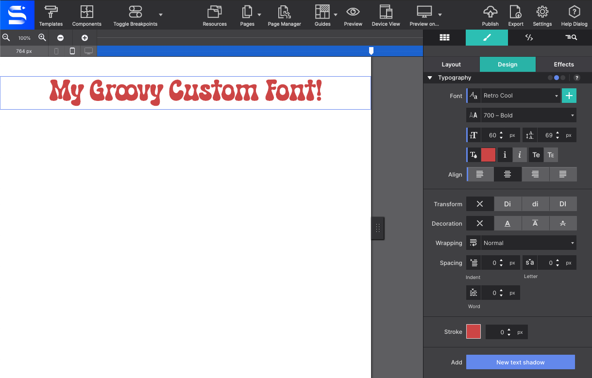
Typography
The right choice of font, colors, and spacing greatly help to communicate the message of a website and contribute to the brand recognition. Site Designer features a big selection of font choices as well as a large set of typographic controls.
Google Font Library
The Font drop down gives access to all the 808 font families in the Google font collection.
Fallback Font
A web safe (system) font can be selected just in case the primary selected font fails to load with the Fallback Font control.
Font Weight
The third dropdown can be used to select the font-weight. Some font families do not provide all options — in those cases the closest available option will be applied.
Font Size and Line Height
The next controls can be used to change the font-size and line-height for the active selector. These two properties can be specified in different units of measurement such as pixels (currently selected in the image) ems and rems. Clicking on the active unit will bring up a dropdown with other available options.
Font Color
The color of the font can be changed by clicking on the little color tile — white in the image — next to the drop. The text element can also be set to be displayed in italic and small caps.
Font Align
The last control visible in the above image can be used to align the text. Left, right, center and justify are the available options.
Custom Web Fonts
The app comes preloaded with a wide collection of Google Fonts. However, you also have the option to import a custom font. For maximum browser support, you may use EOT, TTF, WOFF, WOFF2, and SVG file formats.
Click on Resources > Add Custom Font to load your font files into your project.
Once imported, you'll be able to select your custom font from the Typography styling controls. Your font will appear on the canvas and may be styled visually using Site Designer's controls.
There are a few more typographical controls available. The Text Transform control can be used to specify the capitalization of an element's text. It can be used to make text appear in all-uppercase, all-lowercase or with each word capitalized.
Text Decoration control sets the text formatting for the selector to underline, overline, or line-through. Underline and overline decorations are positioned under the text, line-through over it.
The Wrapping control is for handling the white-space inside the text element which has a big effect on how the text wraps.
The three different spacing icons show the effect of each of the controls on the text. The Text Indent control modifies the indentation of the first formatted line of the block. The second one, the Letter Spacing control, adds space between all the letters of the text element. And last one, the Word Spacing control can be used to add space between words.
Text Stroke
The Stroke feature is an enhancement to your font choice. This allows you to apply a separate color outline, a stroke, around the text.
The base color is selected in the top of the Typography section. Then to apply the stroke color, click the color box to launch the color dialog. Next to the color option, you may also set how thick of a stroke line you want the effect to be.
The Stroke control can also be applied to Container elements. This is handy if you would like to have all children text elements take on the same Stroke appearance.
Text Shadow
The last control for styling text elements is for adding shadow effects.
The ability to add multiple font-shadows, and the ability to control the exact settings for each of them, allows for really cool effects. To activate this, click on New Text Shadow. Below, the control, the shadow options will become available for configurations. Click the New Text Shadow to apply multiple shadow effects.
SITE DESIGNER ROCKS!
The above effect is created using three text-shadows with slightly different settings for the blur and distance values. Higher values for Blur make the shadow wider and longer.
The offset-x and offset-y values specify the horizontal (X) and vertical (Y) distance the shadow is placed from the text. Negative values are allowed — a negative X value places the shadow to the left of the text, and negative Y value above the text.
Working With Text Video Demonstration
Backgrounds
Setting the background to an element will fill the enter space of the Parent element (Container) allotted including Padding and border that is specified on the Style pane > Layout > Dimensions.
Solid background colors can be selected by clicking on the Background color box. In addition to simple solid backgrounds, beautiful full-size background-images can be applied. Background gradients can also be declared in CSS directly. This offers better control over how the gradient is displayed as well as increased performance compared to using an image file.
You can jazz up the Background of an element using a specific color, add an image, or apply a gradient.
Then there's the ability to use multiple-backgrounds. Combining images with overlaying semi-transparent gradients for example, can create really stunning effects.
The order in which these backgrounds are being applied is important for the desired effect. Generally speaking a gradient will need to be on top of an image, a small image on top of a larger image, etc.
The first (top) background displayed, will be visible on top within the canvas with the lower image layered behind the first. To reorder the background layering you can grab the arrow icon, and drag it up or down to a different position. Clicking on a background will open it up to tweak the settings. Let's look at the gradient settings first.
Background Gradient
A gradient is made of a progressive transition between two or more colors. A linear gradient follows a line on which the colors fade from one color into the next. A radial gradient starts at a center and changes colors going to the outside of the circle (or ellipse) type of shape.
Linear Gradient
Linear Gradient
For a linear gradient the angle can be changed by specifying a specific Degree. For example, changing the value from 180 to 90 would make the gradient run from left to right instead of top to bottom. Any value in between is possible as well!
A gradient can consist of up to 4 colors. A Color can be added into the mix by clicking the checkbox. The Stop defines where the color starts. As can be seen in the example below, the colors don't have to transition, a 'hard-stop' can be created by giving two color stops the same value.
Please note that the color defaults to the color of the first stop, which is needed for the effect above.
Linear and radial gradients work in very similar ways, except the degree control is not available for radials.
Background Images
Images can be added to the project locally or linked in from any online source. The Resource drop down control is where you will choose where your image resource. In the example below a local background image is used. When choosing a Local Image from the drop down the Resources pop up window will appear allowing you to import the graphic from your computer.
To change the graphic for an Online Image select URL from the drop down, then paste the full web link to the image location in the box that appears below. For example: https://example.com/my-image
Once your resource is in place, if you change your mind and need to swap it out for another image, click the pencil icon to edit the graphic selection. A dialog will come up from which a choice can be made between the various images in the existing collection in the project. New images can be added to the collection as well.
Images can also be changed at breakpoints, this way smaller and lighter file size images can be served to smaller devices (which frequently use less bandwidth). This is also handy if you want to show a cropped version of the image for smaller screens.
The Position control can be used to move the image. The default values are Left and Top. Custom values can be used as well — in the example the image has been moved so the surfer takes up a central position in the container.
The Attachment control specifies if the image's position is fixed within the viewport, or can scroll along with its containing block. The local setting means that if the element has a scrolling mechanism, the background scrolls with the element's contents. The fixed setting works well for large background images on containers. Please note that mobile devices offer limited support for fixed backgrounds as it is (said to be) resource intensive and negatively impacts battery life. A good practice is to change from Scroll to Fixed for desktop devices, more or less on the right of the second breakpoint.
Container with a background FIXED image
Notice how the background is fixed relative to the viewport. It’s kind of like a window, so when scrolling, it changes your perspective. It is like you are seeing a small piece of the background that follows you with the scrolling.
Container with a background SCROLL image
In this other case you are seeing the image completely, and when you scroll, you alway see the same.
Small image patterns are frequently used to create a full background pattern. This is done using Repeat. In the example below a tiny thumbnail is instructed to repeat along both the x and y-axis. Alternatively the image can be only repeated along the x or y-axis, or not at all.
The Repeat control can be used to create a full background pattern. This is done using small images to create patterns. In the example below a tiny thumbnail is instructed to repeat along both the x and y-axis. Alternatively, the image can be only repeated along the x or y-axis, or not at all.
The Size control offers many options for specifying the size of the background-image. Images can be scaled up or down, made to cover the entire background or be instructed to display entirely. It's a very useful control so let's have a more detailed look.
The default is Auto, which tells the browser to calculate the size based on the actual size of the image and its aspect ratio. Frequently used for full-background sections.
Cover tells the browser to make the image cover the entire container. Even if the images need to be stretched or cut a little bit off (on the edges). This is especially handy in a responsive design where the size of the element or container with the background usually has a variable width (and/or length).
The Contain setting on the other hand, gives the instruction to always show the whole image, even if that leaves a little space to the sides or bottom.
A Custom size can be specified for the width, height or both. By unchecking either or both Auto boxes a value can be specified. Please note that this can easily influence the aspect ratio and cause distortion in the image — use with care!
The Origin control is a less frequently used setting. It defines where the top-left corner of the background starts. Starting with the outside part of the element, the background extends to the edge of the border using the border-box value. The padding-box setting makes the background start at the border (underneath the padding) using padding-box. When using content-box the background is restricted underneath the content area. Container type elements don't have a content area and this setting will have no or minimal effect.
The Clip control works in a similar way, except it clips the background instead of resizing it. As with the Origin control, it is a less frequently used setting.
Borders can be added to elements using the Border control. Clicking on the circle in the center of the icon selects (or deselects) all borders. That does not mean that a border is enabled or disabled, it is just a way of selecting the border(s) for applying the style settings with the other controls.
Multiple borders can be styled at the same time. In the image the top, right and left border have been selected and a border-width or 2px has been applied. The border-style is (a) fixed (line) and the specified color is orange.
The bottom border — deselected in the image — has the same style and color, but has a width of 6px. This can be seen by deselecting the other borders and clicking on the bottom border in the icon to select it. The example below shows the result of the border (and border-radius) definitions.
If borders are selected that have different styles applied, a red line is visible at the bottom of the controls for which the styles differ. If these styles are changed, they will be synchronized over all selected controls and the red line will disappear.
The border-width values are not the same for all borders.
Tool set for the border and border-radius.
In terms of selecting the border, the Radius control works in the exact same way as the Border control. This control can be used to 'round' the corners of an element. It is not required for an element to have borders to do so, in the absence of a border this will be applied to the background of the element.
The higher the value, the more rounded the corners. Setting different values for the horizontal (x) and vertical (y) part of the corner and/or for different corners can be used to create certain shapes.
To create a circle as seen in the flex card example, define an equal width and height, in combination with high radius values.
The Opacity control sets the level of transparency of an element. The possible values go from 1 being opaque (the default state) to 0 being totally transparent. This is applied to its content and children also. So, for example, applying a 0.5 of opacity to a container will make itself and its children to be semi-transparent.
The Box Shadow control is very similar to the Text Shadow control, but it works on the (element) box instead of the text. You can define the horizontal and vertical offsets for the shadow with the X and Y values. If you use negative values it will switch from right to left and top to bottom.
Also, the Shadow can be set on the inner element to make it appear inside the border box. To do this, simply click on the icon with the inward arrows. Also, the Spread control will cause the shadow to expand and grow bigger.
Cursors
The Cursor control allows you to set which type of mouse cursor to show you hover an element with the mouse.
Note that how these are rendered will depend on which OS the page is being displayed. For example, Microsoft Windows will show some of them differently than macOS systems.
Some elements have specific styles you can only apply to them. These elements are the Lists (Unordered, Ordered and Link List elements), the Rule element and the Textarea.
List Settings
The List Type control allows you to choose what type of marker you want for the items inside the list. In case you are using an Unorder List or a Link List you can choose between None (no marker will be shown), Disc, Square or a Circle. The Ordered List has other options like Decimal, Alpha, Greek or Roman characters for the marker, and these can be Lower or Upper characters.
The Position control is pretty straightforward, as you can choose if you want these markers Inside the element, or Outside of it.
Rule Settings
The Thickness control will let you control how much height you want for you rule separator. Then, with Color control, you can choose which color you want for it.
Textarea Settings
The Resize control lets set if you want your Textarea element to be resizable, and if so, in which direction (Vertical, Horizontal or Both). This could help your website visitor to have more space to write with his comments on a form.
Object-Fit & Object-Position (Advanced)
These CSS controls are available for the Picture, Picture Link, and HTML5 Video Elements for better positioning images and videos in a semantic way.
These controls allow the image or video to auto-fill its container without losing its aspect ratio. No more hacks to fix distorted or cut off images. There are several values for implementing this handy method for scaling and cropping images.
Note that you may need to specify some width and height to the image or video, and change its position to be absolute in order to stretch the image/video in its container. For videos, we include a prebuilt “Background Video Container” element to avoid the hassle.
The Fill value will allow the object to completely fill the container. If the image's aspect ratio does not match the aspect ratio of its container then the image will be stretched.
Selecting the Contain value will allow the image to fill the container while preserving its aspect ratio. The image will become letterboxed in the container if its aspect ratio does not match its container.
The Cover value will size the image to maintain its aspect ratio while filling the element’s entire container, clipping the graphic if the ratio does not match.
The Scale Down option will shrink the image in the container.


